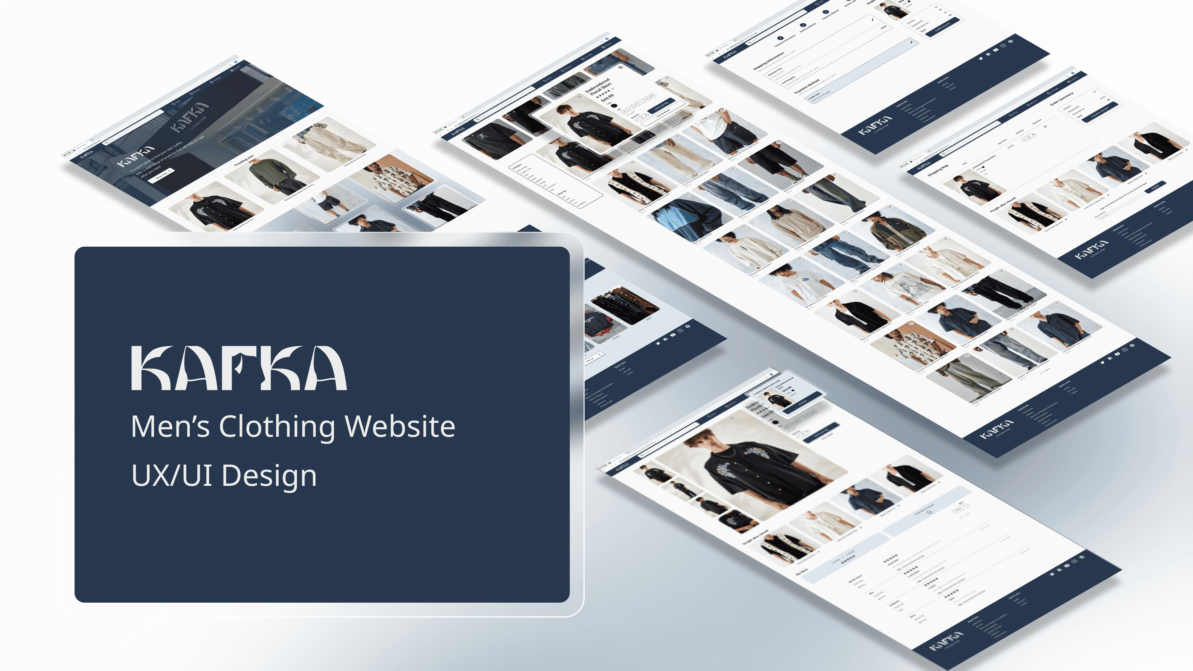
UX CONCEPT CASE STUDY
Men clothes website
The product
Kafka is a website specializing in men’s fashion. This is a place where men can easily find the right clothes for them with collections of reasonably priced men’s clothing options.
Project duration
Jun 2023 - Jul 2023
My role
UX Designer designing from conception to delivery.
Tools I used
Figma, Adobe Photoshop, Adobe Illustrator
Understanding The User
User Research
Summary
I conducted interviews and created empathy maps to understand the users I’m designing for and their needs. A primary user group identified through research was male adults who have lack of time and low budget to buy clothes.
Research shows that time and budget are not the only reasons why men find it difficult to find clothes for themselves. Other problems users face include having too many items displayed on the website, complicated checkout processes, and difficulty in returning items.
Pain Points
Time: Users don’t have time to choose and buy their clothes in-store
Budget: User with low-budget get hard to find the clothes with an acceptable price
Clutter interface: Too many items display on shopping website make user overwhelming
Persona
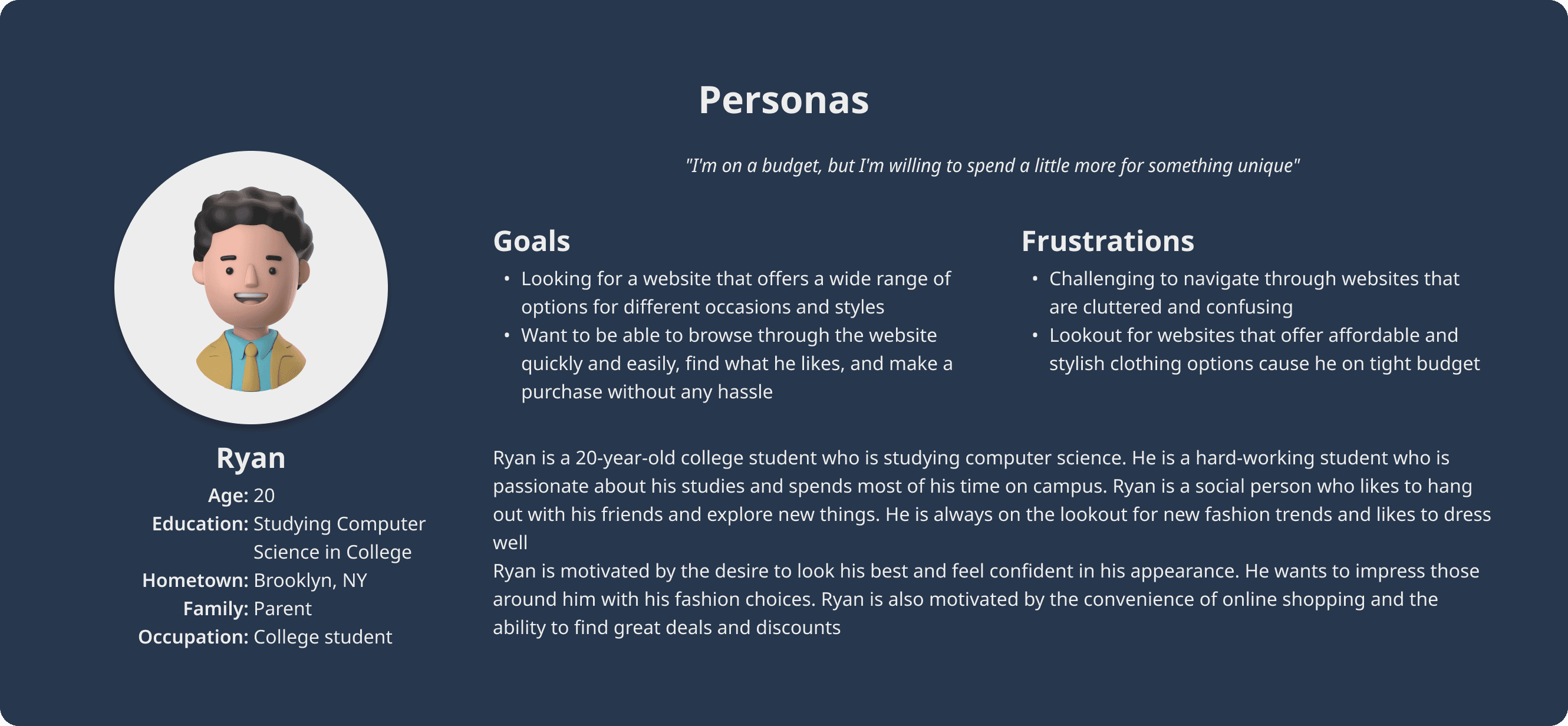
Problem Statement
Ryan is a budget-conscious college student who needs to find a user-friendly website with an extensive collection of reasonable price men’s clothing option, because he has financial constraints.
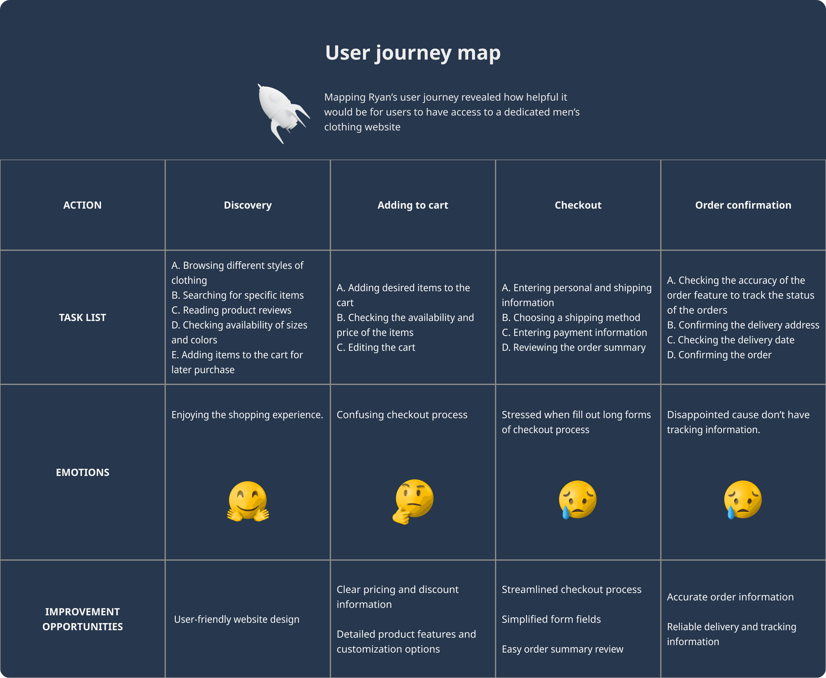
User Journey Map
Starting The Design
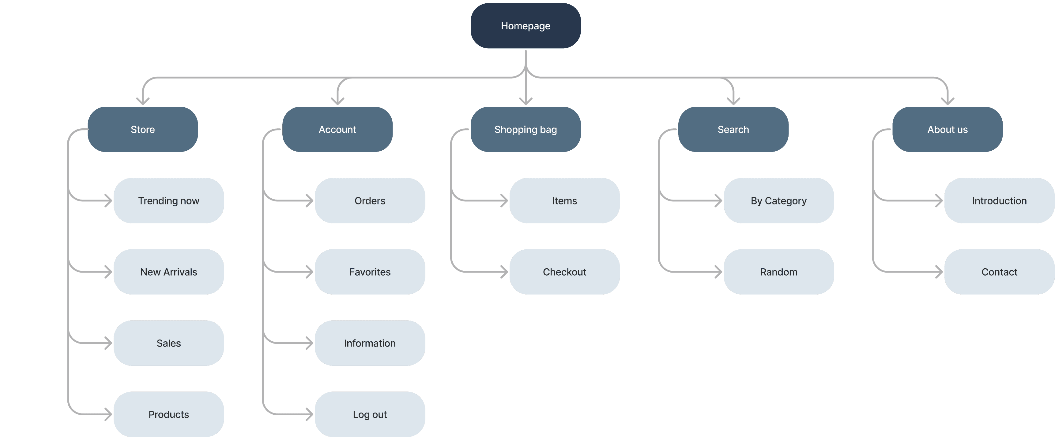
Sitemap
Create a sitemap to help us easily visualize the site structure.
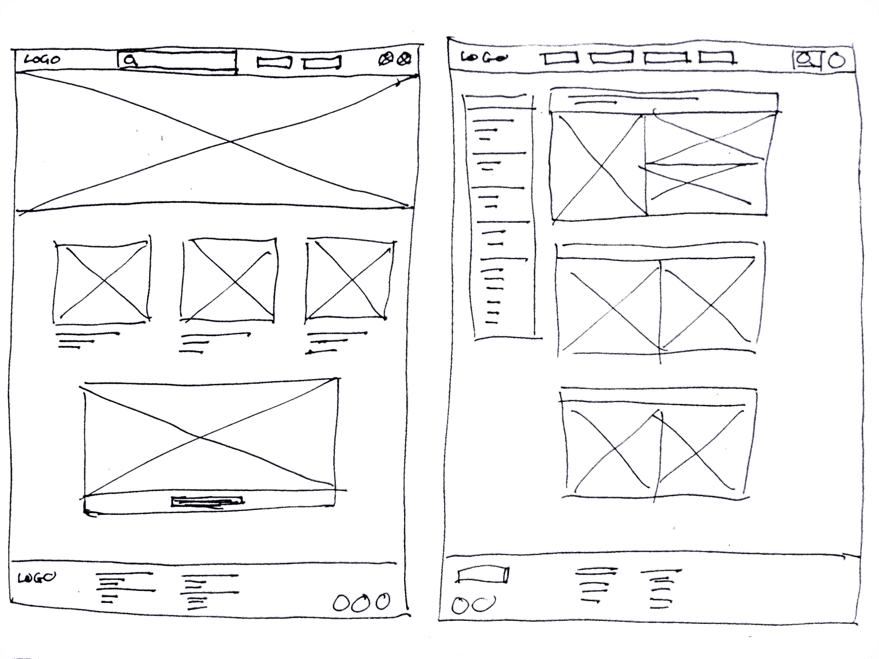
Paper Wireframes
Taking the time to draft iterations of each screen of the website on paper ensured that the elements that made it to digital wireframes would be well-suited to address user pain points.
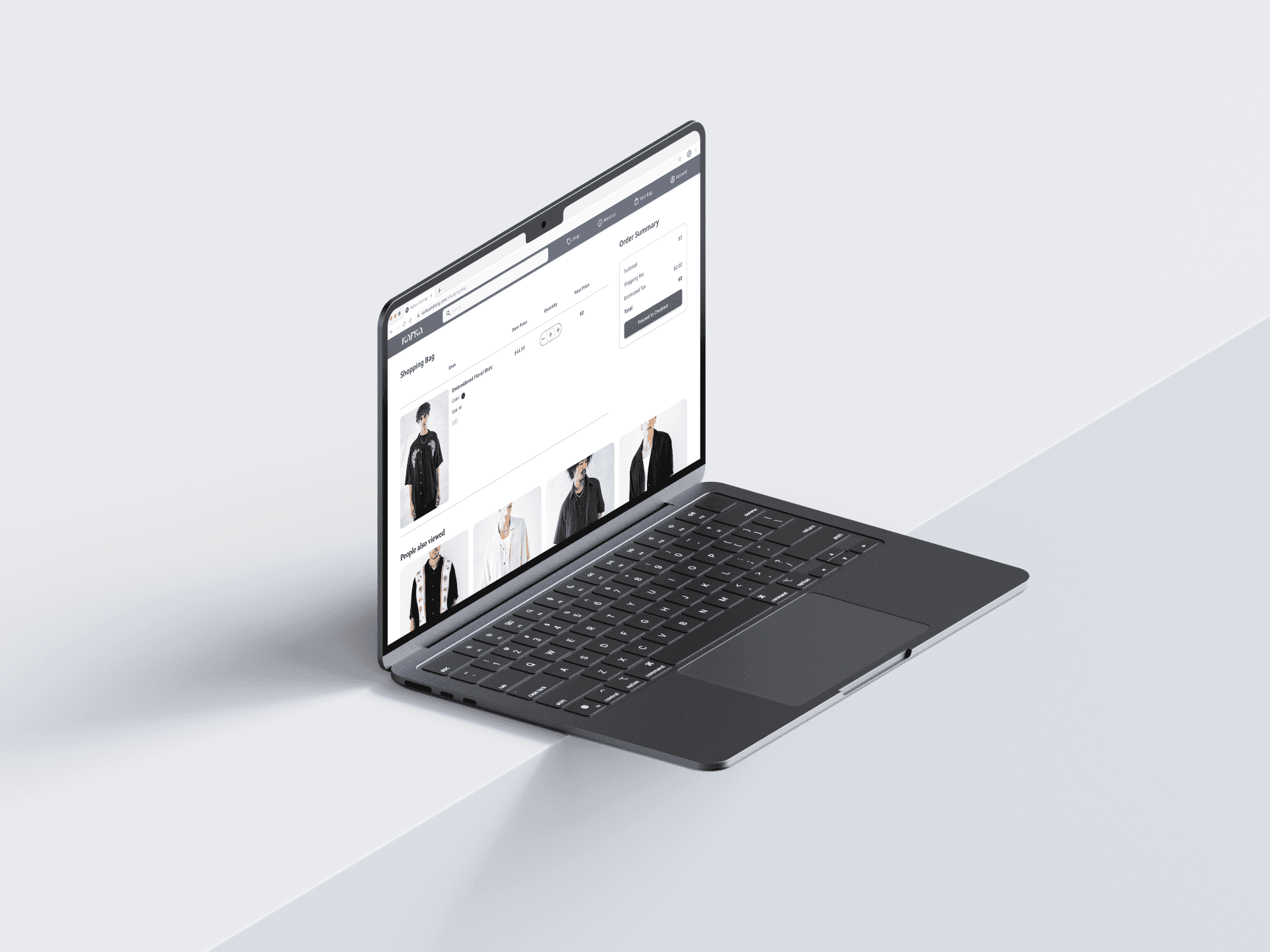
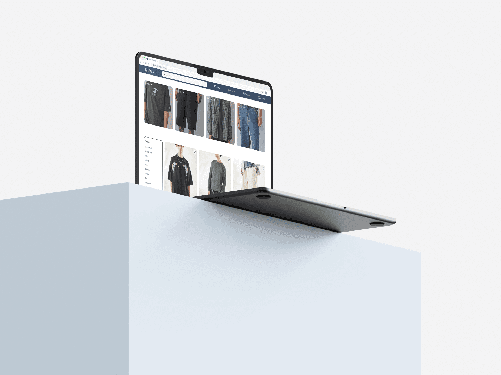
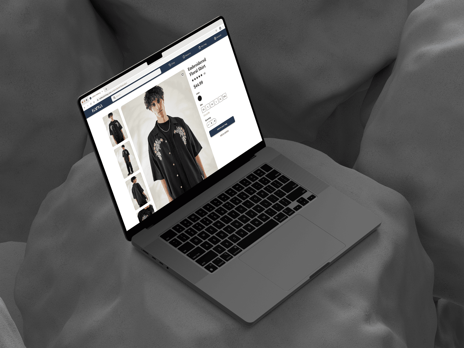
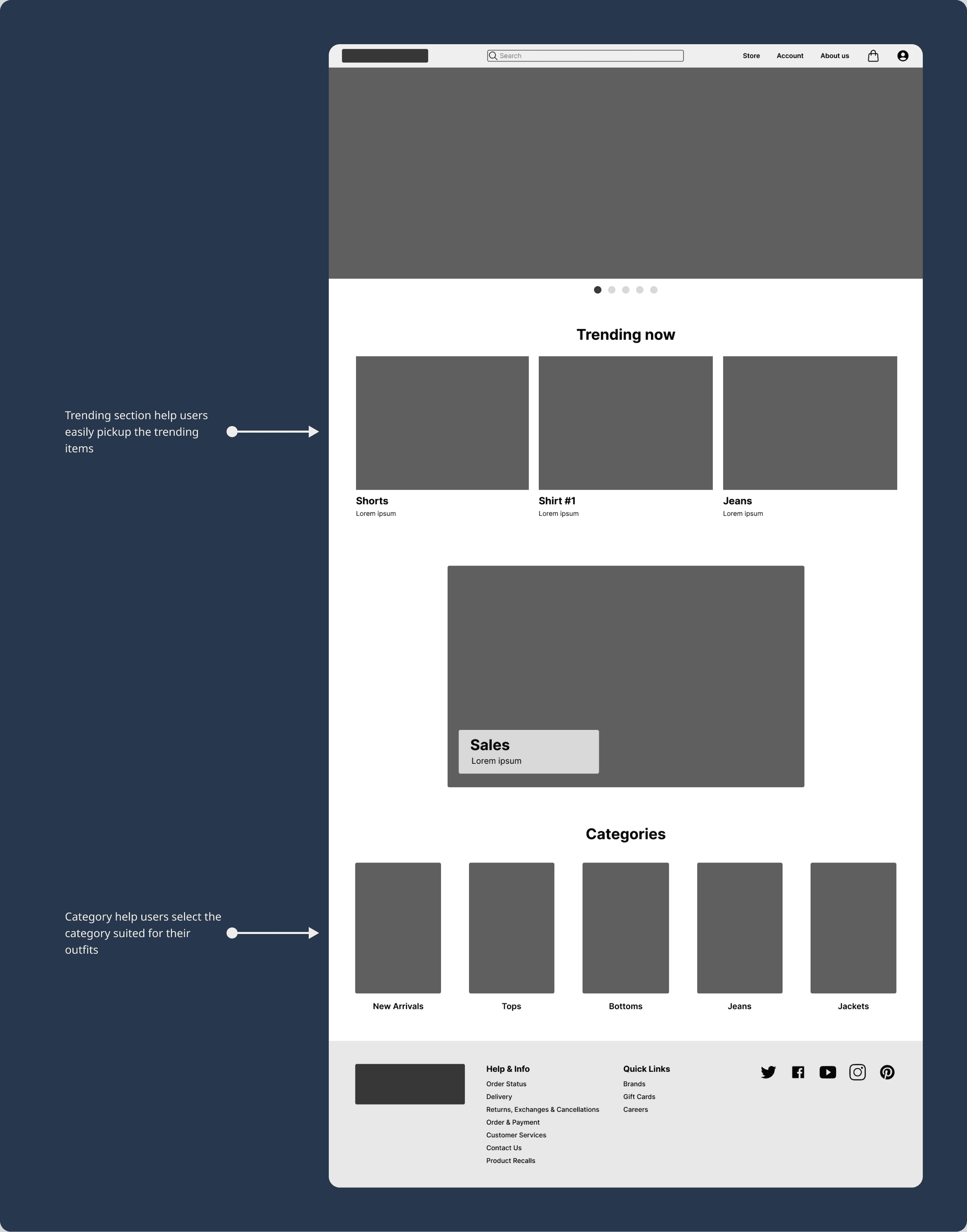
Digital Wireframes
As the initial design phase continued, I made sure to base screen designs on feedback and findings from the user research.
Usability Study
Parameters
Study type: Unmoderated usability study
Location: Vietnam, Remote
Participant: Five participants
Length: 20 - 30 minutes
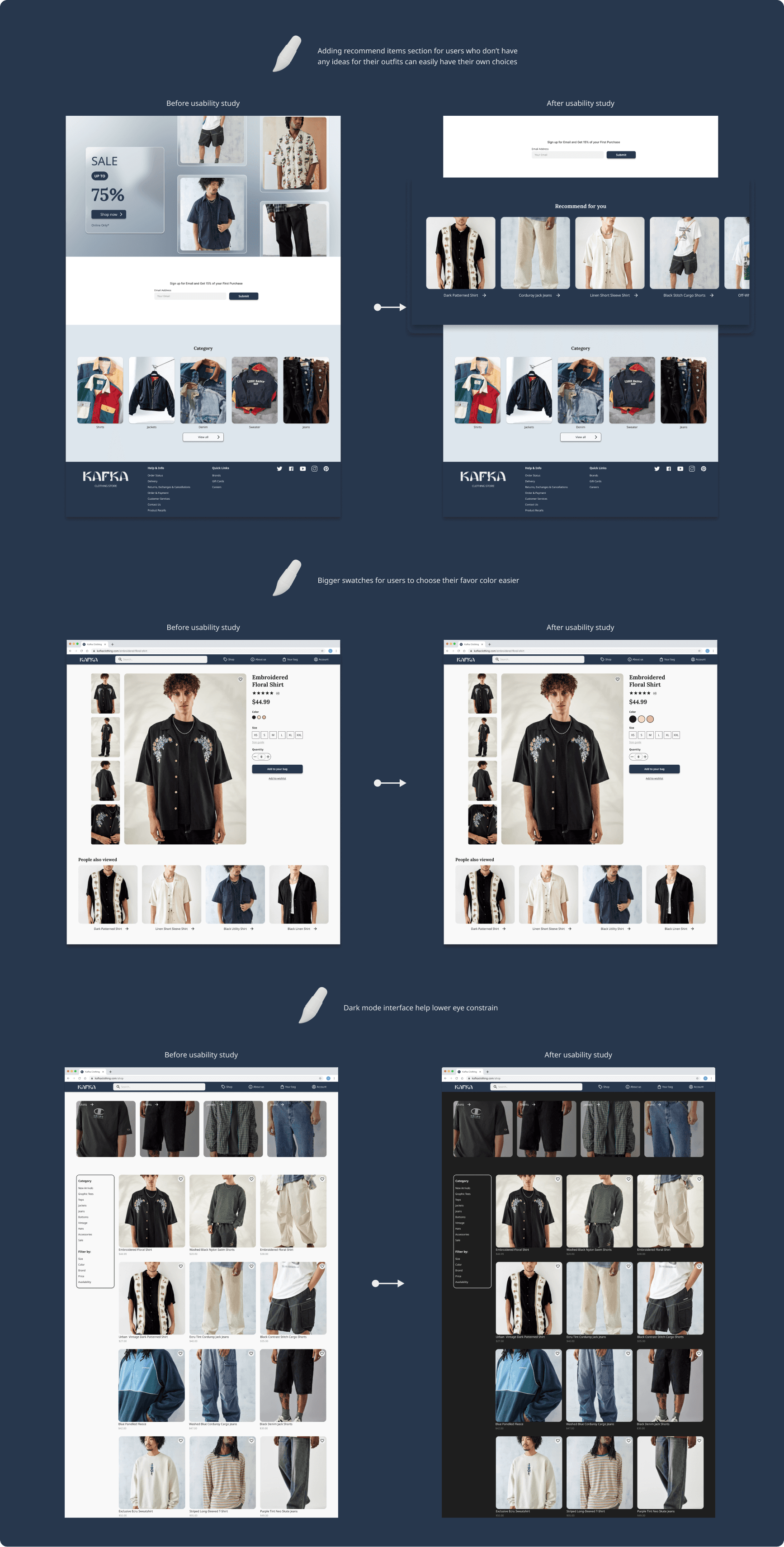
Findings
Adding recommend items: To help the users who don’t have any ideas of the outfit they want.
Bigger swatches: To help users who struggling when select colors of the products.
Adding color and size to searching filter: Users can find the products based on color and size they want.
Refining The Design
Design System
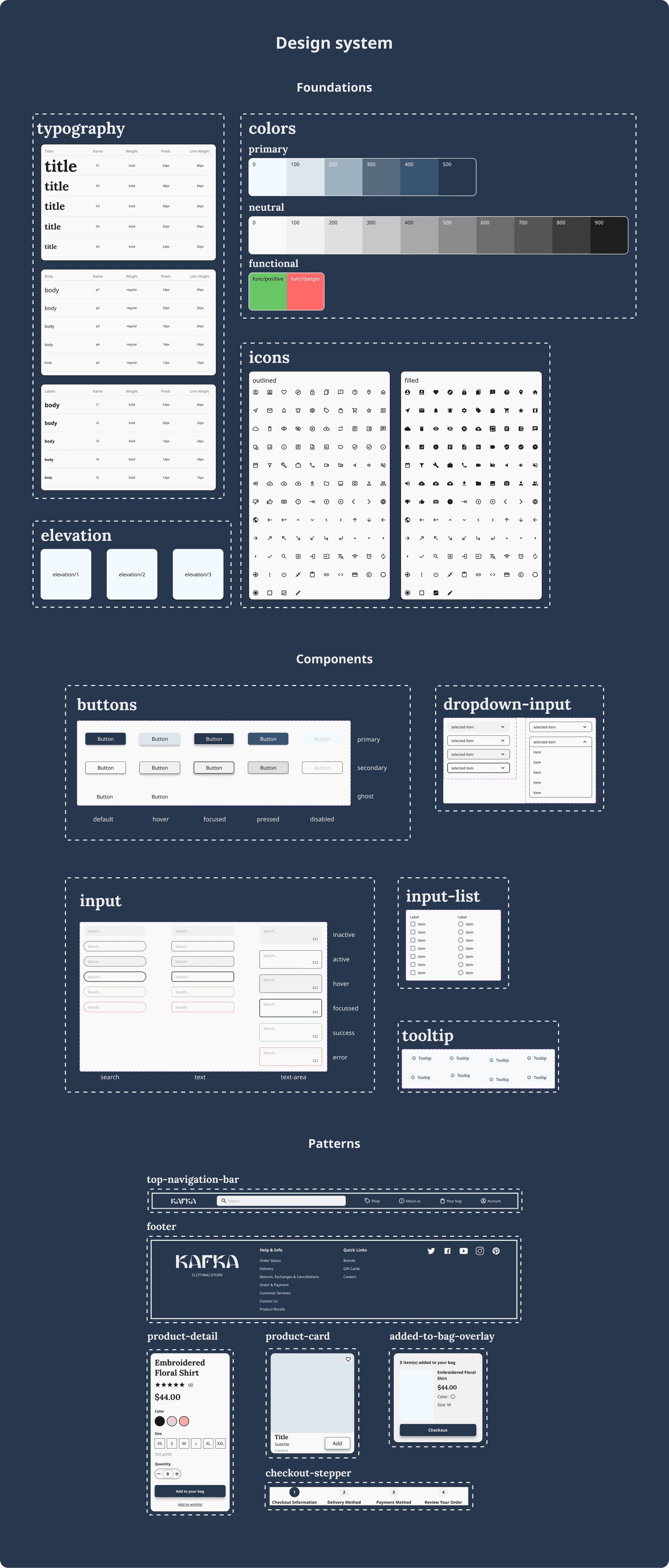
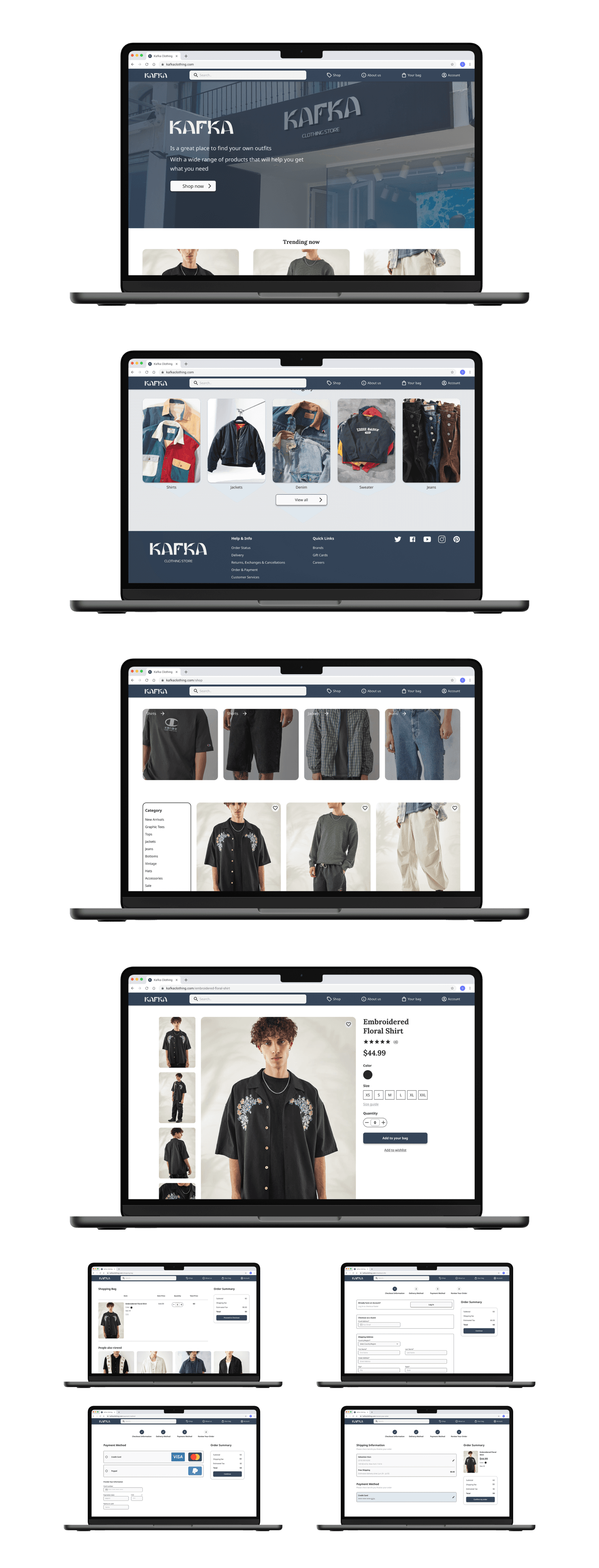
Mockups
Accessibility Consideration
Provided access to users who are vision impaired through adding alt text to images for screen readers.
Used icons to help make navigation easier.
Used detailed imagery for clothes to help all users better understand the designs.
Getting Forward
Takeaways
Impact: The website makes users feel like it really thinks about how to meet their needs.
What I learned: While designing the Kafka Men’s Clothing website, I learned that the first ideas for the website are only the beginning of the process. Usability studies and peer feedback influenced each iteration of the app’s designs.
Next Steps
Conduct another round of usability studies to validate whether the pain points users experienced have been effectively addressed.
Conduct more user research to determine any new areas of need.